A Refreshed Look for a Healthier Tomorrow
We’re excited to unveil Our Next Chapter, a brand evolution that reflects our continued dedication to a safer, healthier future. Our journey began with a deep dive into our core values. A collaborative exploration with our creative partners led us to embrace the earth’s natural elements as a source of inspiration. This connection to nature resonates with our commitment to sustainability and our passion for creating a healthier world.

A NEW IDENTITY
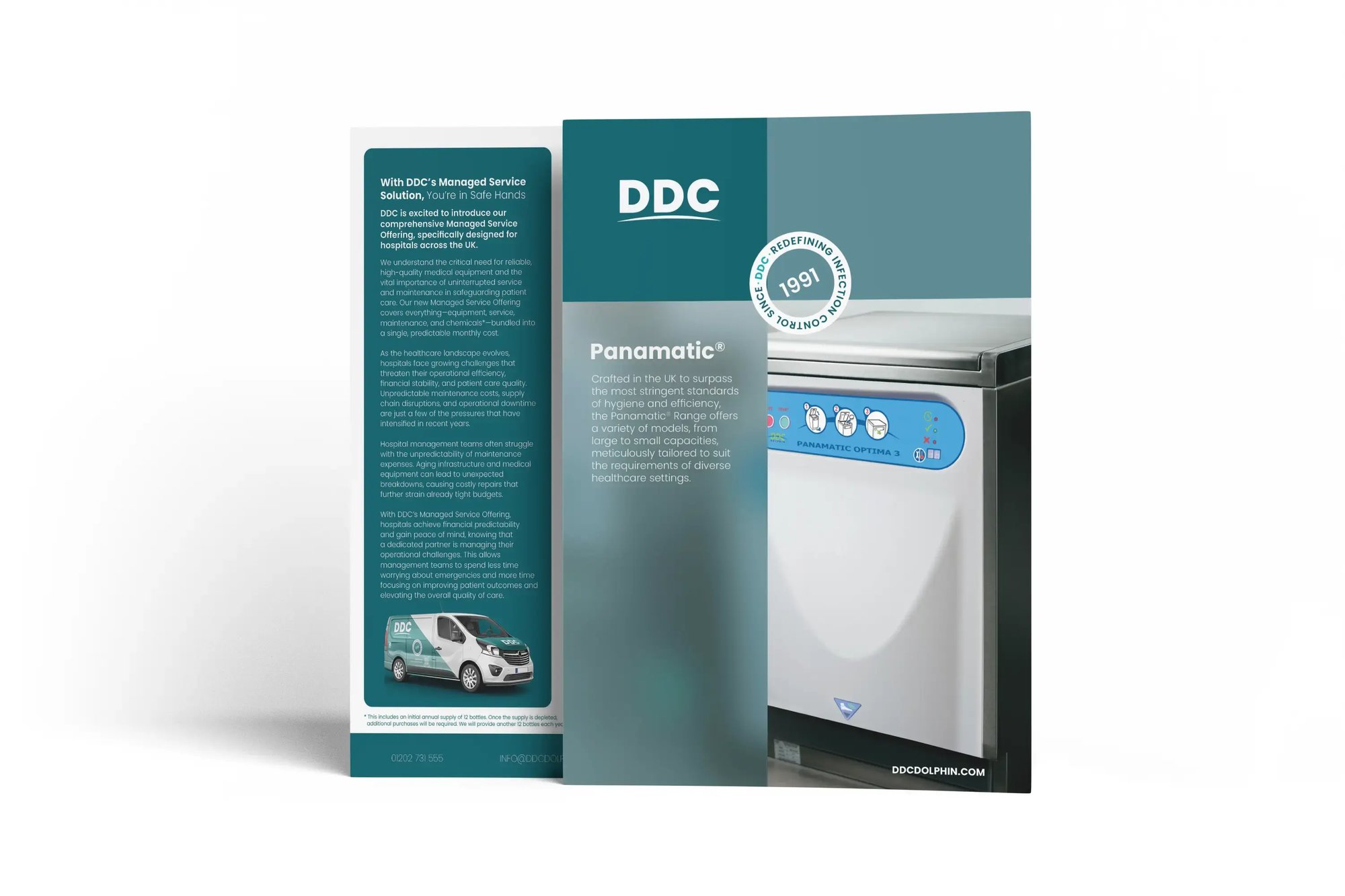
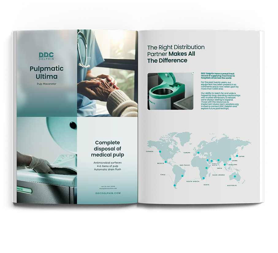
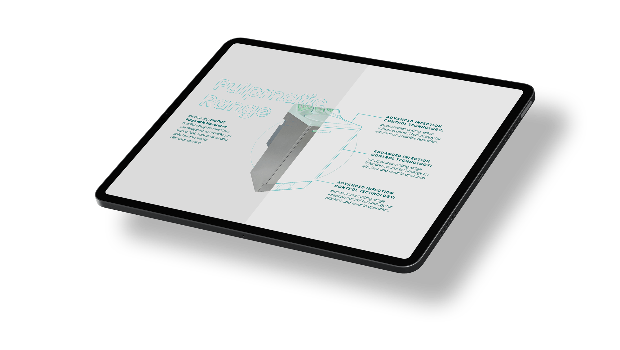
Our refreshed brand identity now incorporates natural patterns, calming colours, and refined typography. This aesthetic transformation aligns with our focus on creating simple, intuitive products that seamlessly integrate into healthcare environments.

LOGO
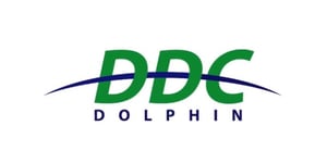
We’ve also reimagined our logo, achieving a balance of modernity and heritage. The streamlined design pays homage to our history while symbolising our forward-thinking approach.


INSPIRED BY NATURE
Our new colour palette draws from the calming hues of nature, evoking a sense of cleanliness and trust. The teal, reminiscent of clear waters, symbolises our commitment to hygiene and purity. Earthy greens and blues ground us in our sustainability efforts, reflecting our dedication to using eco-friendly materials.

CLEAR AND CLEAN
The clean lines and uncluttered aesthetic of our new branding communicate a sense of clarity and efficiency. This design philosophy mirrors our approach to product development, where we strive for simplicity, ease of use, and reliability.
We believe that a modern, streamlined look not only enhances the aesthetic of your healthcare environment but also reinforces the confidence you can place in our products.

